
Featured Projects
This was created as a Final Project for an Intro to Graphic Design 1 class. The prompt was to create something relevant to the material taught during the course. I decided to create a promotional ad poster for the anime, One Piece, depicting the final moments of the chapter of the story called Wano. Using various tools to make this was very time-consuming as I played with opacity and color definition with each PNG image. Lots of cropping from each individual image, as well as color matching for the overall aesthetic of the promotional art, including overlaying and masking background images.
Size
11.25 x 11.25 in
Client
California State University, LA Course
One Piece: Wano Arc Finale
This composition was created for a Halloween event at UC Riverside. The project consist 3 colorful alcoholic beverages, each of which was presented in PNG photographic format taken from stock images online. The background and border frame was also made by the use of AI, by simply asking for a Halloween theme spider frame, enough space for the image, and a product description to be placed. On both titles and descriptions of the beverages, 2 fonts were used: BookmanJFPro and Antique Olive Cond. Additionally, I color coordinated both bodies of text to their respective beverage color.
Size
8.5 x 11 in
Client
North District UCR
UCR Halloween Party Bar Menu
This Project was a final project made in a Graphic Design 1 class. The Objective was for all of us take a poster from a known company and redesign it in our own way, choosing one of the various design methods: typography, illustration, imagery, and environmental design as a main pinpoint to attract their audience. For this, I chose typography, making it the dominant method for this poster. A few pain points that I found while finishing this product were the placement and alignment of the text box. Although that was based on observations of mine, other class acquaintances found it very unique as the only imagery was their logo, and the use of mask overlaying made it stand out for the title of the event. The font used for this project was called Impact.
Size
8.5 x 11 in
Client
California State University, LA Course
San Diego Comic Con Poster
This project was created as the first project for an Intro to Graphic Design 1 class. The prompt was to create a flyer for an event related to someone or something, and then determine the details from there. I decided to design a flyer for a video game character from the game VALORANT by Riot Games. Essentially, I wanted to make a birthday flyer for the company’s anniversary of the game, so I masked it as a birthday party for one of their mascot characters, Gekko. I stuck with only two typefaces and enhanced color coordination for the character itself, alongside logos of ownership from both brands, as a mockup for an official poster. This also came with the use of shapes and opacity to try to regulate the background imagery.
Size
8.5 x 11 in
Client
California State University, LA Course
Gekko’s Birthday Flyer
This piece of work is a page taken from a book project made for a Graphic Design 2 class. The elements used in the page are both Adobe Photoshop and Illustrator, enhancing what represents a cartoony figurine. The prompt of the book project was to choose a personal possession/object and design the said object, choosing 4 design choices: illustration, typography, contemporary, or imagery. Here photoshop was used to configure the contrast and saturation of the background image of TMNT action figures. Illustrator was used to convey the star shape and the drawn cartoon figurine. This page is the very first page of the book, which is also considered the introduction of this book project. “The Figures of Society” depicts my personal interest in collecting figurines as well as the obsession I had with toys as a child, and how I expressed my interest in this topic was by presenting illustration and imagery as the main design choices for this book project.
Size
8.5 x 11 in
Client
California State University, LA Course
The Figures of Society
The latest installment Hurry Up Tomorrow by The Weeknd, marks an end to the artist’s persona and trilogy of his recent 2 albums of the 2020’s, After Hours and Dawn FM. He announced a 2025 Summer tour, and I have decided to take the opportunity to make a mockup of what the tour flyer could have looked like. The name of the tour is called After Hours Till Dawn, but to make it more appealing and correlate to the theme of his recent installment, I decided to add on more to the unique title, After Hours Till Dawn: The Opera Soars Tour. This poster, I wanted to focus more on the typographic aspect rather than its imagery, so placement was crucial, most especially with the name of the event, location, dates, pricing, and times. Both texts used the fonts Sofia Pro and Antique Olive Nord D. For the imagery, I decided to take the collage route, inspired by the streets of LA, poster collages scattered across the Hollywood area. Each image was modified to be desaturated and with the use of thresholding to have a black and white photographic look, and then was cropped to implement the background color, which is inspired by the overall color theme of Hurry Up Tomorrow.
Size
8.5 x 11 in
Client
California State University, LA Course
After Hours Till Dawn Tour Flyer Mockup
Toasted Bun is an American breakfast diner, made back in the 1960s in the Glendale, CA area. Toasted Bun has been around for decades, but struggled to find ways to expand their brand to a broader audience. Here, I was able to rebrand their logo and give a brand message to center their signature theme. Using Illustrator, I was able to make a booming effect around the photoshopped image of the breakfast burger. Using the text placement as well to emphasize the product being shown clearly. The typeface used in this project is Urbane Rounded. This advertisement mockup composition was made as part of a final product rollout for a Graphic Design 2 class.
Size
8.5 x 11 in
Client
California State University, LA Course
Toasted Bun Redesign Magazine Mockup Ad
This promotional poster was designed to highlight FaZe Clan’s new wave of content creators at the time, under the theme “Streamer Era.” The composition blends bold branding with modern streetwear aesthetics, emphasizing both individuality and unity among the featured creators. The layout features a gradient from red to black, creating a dramatic and energetic atmosphere that reflects gaming culture and digital entertainment. The streamers are positioned in a layered composition, giving depth and hierarchy to the visual. The central figure is streamer JasonTheWeen, and is the biggest mainstream creator within the FaZe organization. Adobe Photoshop was the main tool used to create this promotional piece, with extensive use of gradients and masking for each image. As of December 2025, the FaZe content organization officially shut down, with all members leaving effectively.
Size
8.5 x 11 in
Client
Solo Project
FaZe Clan Streamer Era (2025)
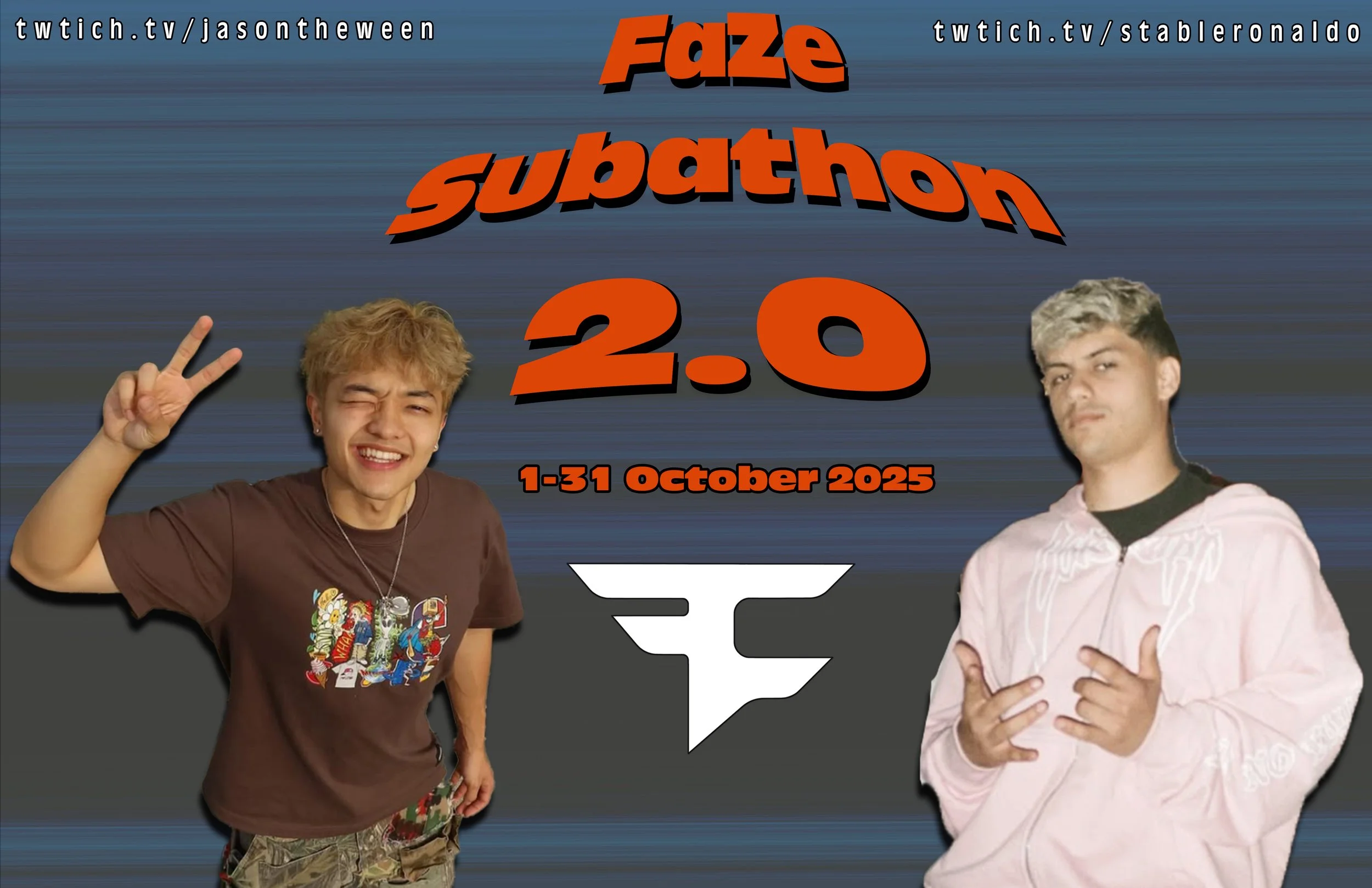
This billboard series was designed to promote the second FaZe Subathon, as a high-energy digital-first event that reflects streamer culture and online entertainment. Bold, saturated colors were used to create immediate visual impact at a distance, with warm oranges and vibrant gradients contrasting against darker tones to draw attention and emphasize urgency and excitement for this virtual event. The imagery centers on prominent FaZe Content Creators, reinfocring personality driven marketing. The type is a variety of fonts, but the most used is heavy, bold, and highly legible, designed for billboard reliability. The hierarchy prioritizes the vent name, dates, and twitch URL’s guiding the viewers eye quickly and efficiently. The mockups place the designs in realistic urban billboard enviorments to demonstrate scale and real world application.
Size
24 x 12 in
Client
California State University, LA Course
FaZe Subathon 2 Billboards
COMING SOON
Size
N/A
Client
N/A